Perfect Color Palette for Any Room can make or break the atmosphere of your space. The right color scheme not only enhances a room’s aesthetic but also impacts mood and functionality.
Whether you’re refreshing a single room or redesigning your entire home, understanding how to choose the right colors is crucial.
From knowing how to use color psychology to mastering complementary and contrasting combinations, selecting the right palette requires careful thought and planning.
In this guide, we’ll walk you through the key strategies to confidently choose the perfect color palette for any room, ensuring it complements your style and creates the ideal ambiance. Let’s get started!
Understanding Color Psychology
Before you even think about which shades you like or dislike, it’s important to understand color psychology.
Colors have the power to influence mood, perception, and behavior. Here’s a quick overview of what each color tends to evoke:
| Color | Psychological Effect |
|---|---|
| Red | Energy, passion, excitement, and warmth. |
| Blue | Calm, relaxation, tranquility, and trust. |
| Yellow | Happiness, optimism, creativity, and energy. |
| Green | Balance, growth, health, and peace. |
| Purple | Luxury, creativity, wisdom, and spirituality. |
| Orange | Enthusiasm, vitality, warmth, and comfort. |
| White | Purity, simplicity, cleanliness, and spaciousness. |
| Black | Sophistication, elegance, and mystery. |
| Gray | Neutrality, balance, sophistication, and calm. |
| Brown | Warmth, stability, reliability, and comfort. |
By understanding how each color impacts a room’s mood, you can create a space that aligns with its purpose.
For instance, cool blues are perfect for a bedroom where relaxation is key, while vibrant oranges and reds may work best in social spaces like the living room or dining room.
Consider the Room’s Purpose
The purpose of the room should be your first consideration when selecting a color palette. Ask yourself, “What do I want this room to feel like?”
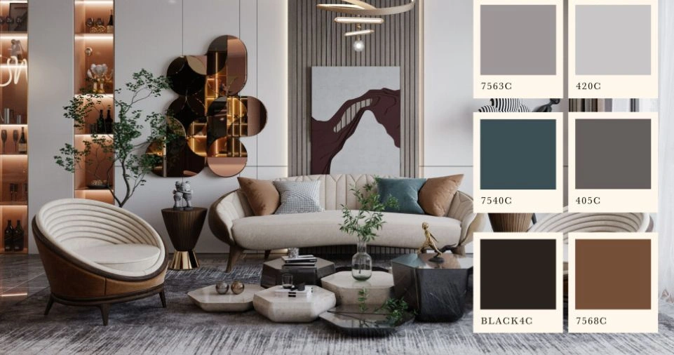
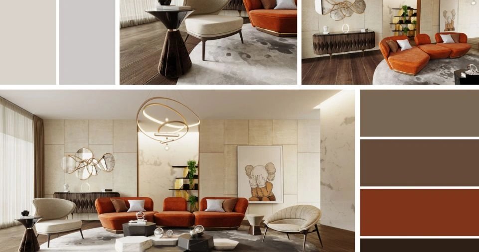
- Living Rooms & Family Rooms: These are spaces where you entertain guests and spend time with loved ones. For a welcoming and vibrant vibe, choose warm tones like terracotta, gold, and rich reds. Alternatively, if you prefer a more relaxed atmosphere, cool blues, greens, or neutrals like gray and beige might work best.
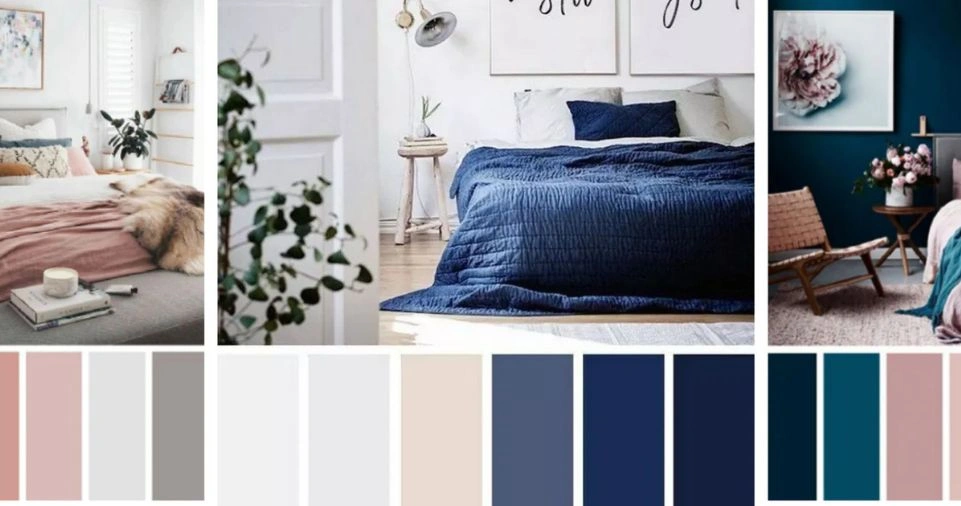
- Bedrooms: This is a place to rest and recharge, so colors that promote tranquility and sleep are essential. Soft hues like pale blues, muted greens, lavender, and even neutral tones like soft whites and taupes are great options. Avoid overly bright or stimulating colors.
- Kitchens: Since this space often serves as the heart of the home, it’s important to pick colors that stimulate appetite and conversation. Red and yellow are popular choices for kitchens because they evoke warmth and increase energy, but you could also use a combination of whites and warm wood tones to create a fresh, inviting feel.
- Bathrooms: For bathrooms, you might want to focus on shades that create a clean, serene, and spa-like environment. Soft blues, whites, and light greens are classic options. However, if you’re looking to create a bolder look, dark shades like navy blue or charcoal gray can provide an elegant contrast.
Choosing the Right Color Palette for Any Room
Once you’ve identified the purpose of the room and the type of mood you want to evoke, it’s time to choose your color palette. Here are some tips to help you choose the perfect combination:
Start with One Color
Often, the best way to start the process is to select one color you absolutely love. Whether it’s a shade of blue, green, or a neutral, this color can serve as the foundation of your palette.
From there, you can build complementary colors that enhance the overall aesthetic of the room.
For example:
- If you choose a navy blue accent wall, you could complement it with softer tones like light gray or white for the furniture and flooring.
- If you opt for a neutral base, such as beige or light gray, you can easily add pops of color through throw pillows, art, or an accent wall.
Understand the Color Wheel
A key tool for selecting colors is the color wheel. The color wheel is a visual representation of primary, secondary, and tertiary colors that can guide you in choosing harmonious combinations. Here’s how you can use it:
- Complementary Colors: These are colors that sit opposite each other on the color wheel. For example, blue and orange or green and red. Complementary color schemes create a striking, balanced contrast and can add excitement to a room.
- Analogous Colors: These colors sit next to each other on the wheel, creating a serene and harmonious palette. For example, blue, blue-green, and green. Analogous color schemes are great for creating a calm, unified look.
- Triadic Colors: These colors are equally spaced around the wheel. An example would be the combination of red, yellow, and blue. Triadic schemes are vibrant and playful.
Consider Lighting
Lighting can dramatically alter how a color looks in a room. Natural light is the best way to highlight the true hues, while artificial lighting (like yellow-toned bulbs) can make colors appear warmer.
Always test paint samples in different light conditions to see how they will change throughout the day.
- Daylight: Natural sunlight will make colors appear lighter and more vibrant.
- Warm artificial light: This will add warmth to cool tones and make warm tones more intense.
- Cool artificial light: Fluorescent lights can make colors appear cooler, so you might want to avoid very cool hues if your room lacks natural light.
Create a Balanced Palette
To create a balanced color palette, you’ll want to think about the amount of each color in the room. The 60-30-10 rule is a great guide for achieving harmony:
- 60% of the room should be your dominant color (usually a neutral or soft tone that covers wall and large furniture pieces).
- 30% should be your secondary color (used in accent furniture, rugs, or curtains).
- 10% should be an accent color (bright, bold hues used sparingly through accessories like throw pillows, artwork, or lamps).
This rule ensures that no color overwhelms the space, and it allows for visual interest and balance.
How to Test Colors Before Committing?
It’s easy to get excited and buy paint and decor immediately, but testing your chosen color palette before committing is essential. Here’s how to do it effectively:
- Paint Samples: Purchase small paint samples and apply them to the wall in multiple spots around the room. Observe how the colors change with different lighting at various times of the day.
- Use Paint Apps: Many paint companies offer apps that allow you to virtually test colors in photos of your room. While these apps aren’t perfect, they can give you a general idea of how colors will look in your space.
- Create a Mood Board: Use a board (physical or digital) to arrange swatches of your chosen colors, textures, and fabric samples. This will help you visualize how everything comes together.
Choosing Accent Colors and Patterns
Once you have the main colors nailed down, it’s time to consider accent colors and patterns.
Accent colors can add depth and personality to a room. Patterns like stripes, chevrons, florals, or geometric designs are excellent ways to bring vibrancy without overwhelming the space.
Tip: If your main color is neutral (like gray or beige), it’s an excellent opportunity to introduce bold accent colors such as mustard yellow, cobalt blue, or forest green.
Conclusion
Choosing the perfect color palette for any room doesn’t have to be overwhelming. By considering the purpose of the room, understanding color psychology, and using the color wheel as a guide, you can create a space that reflects your personality, enhances functionality, and promotes the right mood.
Experiment with different combinations, test your colors before fully committing, and have fun with the process.
Your home should feel like an extension of yourself, and the right color palette can make all the difference in turning any room into your personal haven.